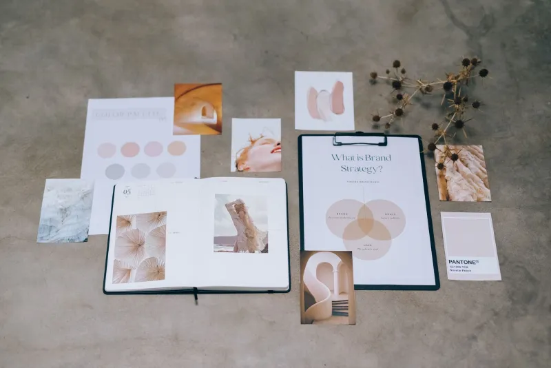
The Palette Precedes the Mark: Building Recognition One Hue at a Time
Ask a customer to describe their favorite neighborhood coffee shop and they will rarely mention the logo. They will say, "the one with the sage green cups," or "the place with the mustard-yellow awning." Color arrives first. It travels at a distance, works in peripheral vision, and survives being printed badly on a receipt. A logo, by contrast, needs proximity, attention, and decent lighting.
For small businesses across the United States, this has a practical consequence: the palette is often doing more daily work than the mark itself.
Recognition Is a Color Problem Before It Is a Shape Problem
Academic research on visual memory has suggested for decades that color improves recognition and recall, but you do not need a study to observe it. Consider the regional bakery whose robin's-egg blue boxes are spotted from across a farmers market, or the Texas landscaping company whose orange trucks are recognizable three blocks before the lettering becomes legible. In each case, the color system carries the identity; the logo simply confirms it.
This is why a brand that changes its colors feels like a stranger, while a brand that refines its logo often goes unnoticed. Color is the part of the identity customers actually memorize.
Why Color Strategy Should Come First
At my studio, palettes are now presented before logo concepts, and the results speak for themselves. When color leads, several things happen:
- The logo is designed in context. A mark drawn in a vacuum must later be forced to live within a palette. A mark designed inside a palette already belongs somewhere.
- Applications resolve faster. Packaging, signage, and web design become straightforward decisions rather than negotiations between competing elements.
- Clients can evaluate honestly. It is far easier to react to a color world — "this feels warm," "this feels clinical" — than to an abstract symbol on a white artboard.
Color also forces useful strategic conversations early. A palette implies an audience, a price point, and a temperament. Those are exactly the questions a brand should answer before a single curve is drawn.
What a Thoughtful Palette Actually Involves
A professional color system is not three swatches pulled from a mood board. It typically includes:
- A primary color selected for distinctiveness within the client's actual competitive environment — including a scan of what every other business on the block is already wearing.
- Supporting tones with defined roles, so there is never a question of when each may appear.
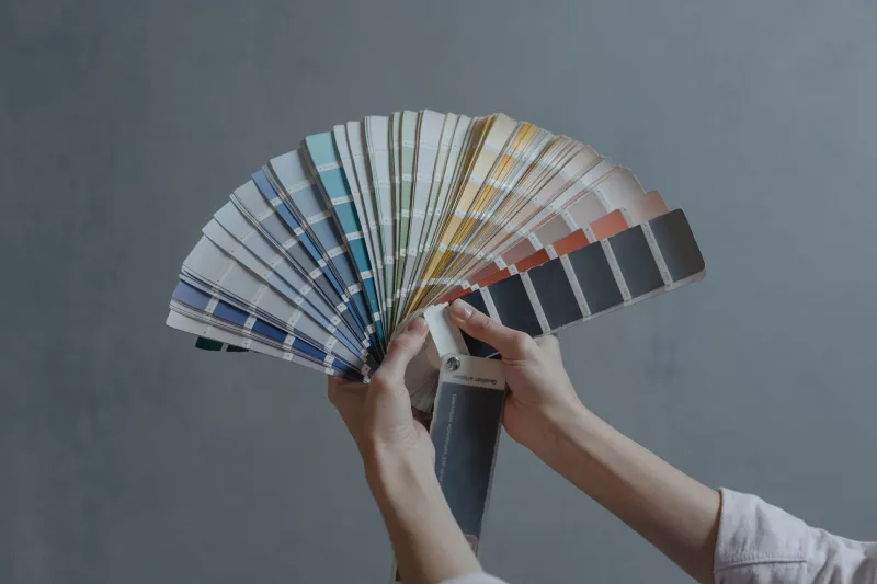
- Functional specifications across print (Pantone, CMYK), screen (RGB, hex), and increasingly environmental contexts such as paint references for physical spaces.
- Accessibility testing, ensuring text contrast meets WCAG standards — a legal and ethical consideration many quick jobs ignore entirely.
- Usage hierarchy, documenting proportions so the brand looks consistent whether it appears on a billboard or a business card.
That is a genuine body of work, and it is why a considered palette is priced as strategy rather than decoration.
What Clients Should Expect to Pay
A "quick pick" — a designer grabbing a trendy hue and moving on — costs almost nothing and delivers almost nothing. A developed color system from a freelance designer generally falls in the range of a few hundred dollars as part of a broader identity project, or $800 to $2,500 when commissioned as standalone strategic work with documentation and testing.
That may sound steep for "choosing colors." But compare it to the cost of repainting a storefront, reprinting packaging, or rebuilding a website because the original palette failed contrast requirements or clashed with a supplier's materials. Color mistakes are among the most expensive mistakes in branding precisely because color touches everything.
The Practical Takeaway
If you are commissioning a brand identity, ask your designer how they approach color and when. If the answer is "after the logo," you are building the house before pouring the foundation. A palette-first process produces identities that are recognizable from across the street — which, for most American small businesses, is exactly where recognition happens.