Nobody Sees Version One: Inside the Drafts Behind Three Shipped Identities
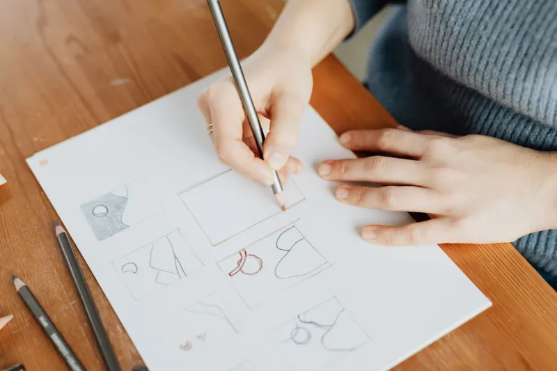
Portfolios are edited conversations. What a prospective client sees on jygraphicdesign.com is the final word of a dialogue that may have run thirty, forty, sometimes sixty rounds deep. The shipped mark looks inevitable — as though it could not have been anything else. That feeling of inevitability is the product. But it is manufactured, not discovered.
This article opens the sketchbooks. Using three anonymized engagements from my own practice, I want to compare where a project started against where it landed, because the distance between those two points is where clients should focus their attention when evaluating a designer.
Case One: The Coffee Roaster That Started as a Monogram
A specialty roaster in the Pacific Northwest came to me wanting a refined monogram — think engraved stationery, old-world European café culture. The first draft delivered exactly that: an interlocking J and R in a Didone typeface, elegant and utterly forgettable in a market saturated with identical pretension.
The break came in round four, when we stopped designing the logo and started auditing the shelf. Every competitor used serif refinement. The differentiator wasn't sophistication; it was warmth. The final identity abandoned the monogram entirely for a hand-drawn roasting drum icon paired with a sturdy slab serif — closer to a vintage farm feed label than a Parisian café. Revenue from wholesale accounts grew noticeably in the first year after launch, because buyers on a grocery aisle had three seconds, not three minutes, to understand the brand.
The first idea was not wrong. It was answering a question nobody was asking.
Case Two: The Fintech Startup and the Thirty-Nine Rejected Marks
A financial wellness app for hourly workers arrived with a deck full of competitor screenshots and one instruction: look trustworthy but not like a bank. Draft one was a shield. Draft two was a shield with a leaf. Draft three was a leaf inside a shield, which at least had the honesty to admit the concept was going nowhere.
What unlocked the project was not a better symbol but a better constraint. We asked: what does this brand look like at 24 pixels on a locked phone screen in a break room? Working at true scale killed every ornate direction on the spot. The final mark — an upward-shifted baseline on a plain geometric wordmark, suggesting a raised paycheck — survived precisely because it was simple enough to survive every format test we threw at it.
Thirty-nine rejected marks sounds wasteful. It was the opposite. Each rejection eliminated a whole family of wrong answers, and the client participated in every round, which meant no surprise at the finish line.
Case Three: The Law Firm That Needed Permission to Change
A seventy-year-old estate law practice in the Midwest feared that any modernization would signal instability to its clients. The first drafts were appropriately cautious — a cleaned-up version of the existing seal, kerning corrected, nothing more. Technically competent. Dead on arrival.
Iteration here served a psychological function rather than an aesthetic one. Round by round, seeing small evolutions on paper let the partners acclimate. By round six, they were proposing bolder directions themselves. The final identity kept the founding year and a restrained navy palette but replaced the seal with a confident contemporary wordmark. The partners signed off unanimously — something the very first presentation would never have achieved.
What Clients Should Take From This
Three practical lessons emerge, and they apply whether you hire me or anyone else:
A polished first presentation deserves scrutiny. If a designer shows you one immaculate direction in round one, ask what was eliminated to get there. Strong process produces options and evidence. A single confident artifact may mean the designer skipped the elimination work — or simply isn't showing it.
Ask to see the graveyard. You need not review every sketch, but a designer who can articulate why the first idea failed demonstrates the reasoning you are actually paying for. "I tried X and abandoned it because it tested poorly at small scale" is worth more than a beautiful moodboard.
Judge rounds by the quality of the questions, not the polish of the screens. A rough draft that reframes the problem — from "what should the logo look like" to "how does this appear on a grocery shelf" — is worth more than a refined rendering of the wrong answer.
The Uncomfortable Truth About Inspiration
There is a romance to the myth of the first idea — the stroke of genius, the napkin sketch. In two decades of practice, I have never shipped a first idea. Not because the first ideas were bad, but because a first idea is a hypothesis, and hypotheses require testing against reality: the shelf, the screen, the sign on the building, the mind of a customer driving past at forty miles an hour.
When you commission an identity, you are not purchasing a drawing. You are purchasing the discipline of iteration — the willingness to be wrong early, cheaply, and privately so the final answer can be right publicly. The version you eventually fall in love with will, in all likelihood, be the one nobody saw coming. Including, quite often, the designer.