The Pinterest Problem: How Moodboards Quietly Flatten Your Brand
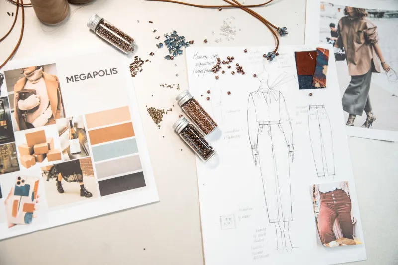
Every designer knows the ritual. A new client arrives with a folder — sometimes a Pinterest board, sometimes a shared album, occasionally a printed stack — of images they love. Warm neutrals. Hand-drawn serifs. A coffee brand from Melbourne, a skincare label from Copenhagen, a wellness studio in Los Angeles. The references are tasteful. They are also, increasingly, identical.
This is the moodboard trap, and it deserves a more honest conversation than it usually gets.
The Convergence Problem
Moodboards became the industry's default discovery tool for good reasons. They compress abstract adjectives — refined, approachable, modern — into something visual and discussable. They surface disagreements early. They give clients a sense of participation in a process that can otherwise feel opaque.
But the same mechanism that makes moodboards useful also makes them dangerous. When a client curates references, they're not curating from the whole of visual culture. They're curating from an algorithmically sorted feed where certain aesthetics — the beige minimalism, the grainy film photography, the lowercase wordmarks — have been amplified into a kind of default setting. The board doesn't reflect what's distinctive about the client's business. It reflects what's currently performing well on someone else's platform.
Multiply this across a few thousand businesses, and you get the landscape we all recognize: independent coffee shops that could swap logos without anyone noticing, direct-to-consumer brands whose packaging is visually interchangeable, law firms and dental practices converging on the same soft, sans-serif friendliness. Nobody set out to look like everyone else. They simply followed the same trail of saved images to the same destination.
Why Distinctiveness Loses to Taste
Here's the uncomfortable part: the problem is rarely the designer's, and rarely entirely the client's either. It's structural.
Clients arrive wanting to be appropriate. They've seen what looks credible in their category, and they want credibility. A moodboard is a low-risk way to say "something like this." The trouble is that appropriateness and distinctiveness pull in opposite directions. A brand can only be so tasteful before it becomes generic — and generic is expensive. It costs you memorability, word-of-mouth legibility, and shelf presence, whether that shelf is literal or digital.
I've sat in discovery calls where a client's board contained four different brands, all lovely, all indistinguishable in silhouette. When I asked which of them they'd want to be, the answer was usually a pause. That pause is where the real work starts.
Moodboards Are Compasses, Not Maps
The fix isn't to abandon moodboards. It's to change what we ask them to do.
A moodboard should answer diagnostic questions, not deliver a verdict. Instead of "does this look right?" the better questions are: What do these references share? Where do they conflict? What does this collection conspicuously avoid? Often the most revealing thing on a board is what's missing from it.
From there, I recommend a few exercises I've come to rely on in my own practice:
- The anti-board. Alongside the references they love, I ask clients to assemble a short collection of work they admire but would never want for their own brand — and to articulate the difference. The boundary between admire and aspire is often where a brand's actual personality lives.
- The words-first test. Before any imagery is pinned, the client writes three sentences describing how they want to be perceived, with no visual language allowed. If the board can't be traced back to those sentences, the board is decorating, not directing.
- The category swap. Take the proposed direction and mentally apply it to a competitor. If it fits them just as well, it isn't a strategy. It's a style.
- The ten-year question. Trends are borrowed; identities are owned. I ask clients which elements of their board they'd still endorse a decade from now, and which ones they'd quietly replace.
What Distinctiveness Actually Looks Like
Clients sometimes worry that "distinctive" means loud or strange. It doesn't. The most distinctive brands in the American market — think of the regional grocers, the family-run restaurants, the independent manufacturers whose identities have outlasted several design trends — are rarely the flashiest. They're the ones whose visual choices trace back to something true about the business: a founder's handwriting, a heritage craft, a genuinely contrarian point of view about their category.
Distinctiveness is earned by subtraction as much as addition. It's what remains when you remove everything on the moodboard that could belong to someone else.
A Better Brief for Both Sides
If you're a client commissioning brand work, bring your references — but bring them honestly. Label which images you love and which you merely recognize as "good design." Tell your designer what the board is for. If you're a designer, resist the ease of building direction directly from the client's board. Your value isn't in assembling taste; it's in finding the one thread that belongs to this business alone.
A moodboard is a starting point, and a good one. Just make sure that when the project ends, your brand looks like it came from you — not from the feed.