Rewarding the Fifth Look: What Enduring Logos Do That Flashy Ones Never Will
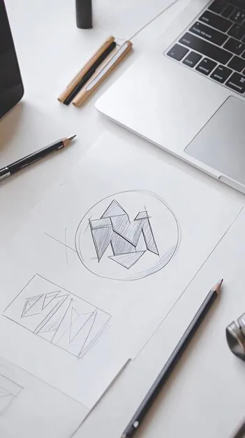
Photo: close-up of logo design sketches on designer desk with grid paper, via img.freepik.com
Every client, at some point in a first meeting, says some version of the same thing: I want people to remember it the moment they see it. It's a reasonable wish. But after two decades of building identities for American businesses — from a third-generation hardware store in Ohio to a fintech startup in Austin — I've come to distrust that yardstick entirely.
The logos that last don't necessarily dazzle on first contact. They reward on repeated contact. And that difference, subtle as it sounds, is the difference between a mark that ages in six months and one that quietly compounds value for twenty years.
The Problem with the Billboard Standard
American marketing culture is addicted to the big reveal. We judge identities the way we judge Super Bowl commercials: did it land? Did it pop? Was there a wow?
But almost no one encounters your logo the way they encounter a billboard. They encounter it on an invoice, a door decal, a packaging sleeve, a browser tab the size of a pencil eraser. They see it in passing, then again, then again. Recognition isn't built in one heroic moment — it's built through accumulation.
When a client evaluates a mark in a single glance, they're really asking: is this impressive? When a customer encounters it a dozen times over a year, the question becomes something else entirely: does this feel like it belongs to a business I trust?
What Repeat Viewing Actually Reveals
Here's what I mean by a mark that rewards the fifth look. In one recent engagement — a specialty coffee roaster in Portland — the client initially gravitated toward a concept with a bold, illustrative crest. It photographed beautifully in a pitch deck. But the direction we ultimately shipped was quieter: a monogram built on a hidden circular grid, where the counter of the letterform echoed the curve of a pour-over kettle.
Nobody noticed that detail on day one. By month three, a customer had posted about it in the shop's online community. By month eight, the local business journal mentioned it in a profile. The mark had become a small discovery — something the audience felt smart for noticing. That is a form of engagement no first-glance spectacle can buy.
The mechanics behind this are unglamorous:
- Optical balance over mathematical symmetry. A mark that looks correct rather than mechanically even keeps the eye returning, searching for the logic behind the harmony.
- Negative space with intent. Shapes formed by absence invite a second look; shapes formed by presence rarely do.
- Typographic craft at the detail level. A hand-tuned curve or an unexpected terminal reads as quality on the tenth viewing, even if the viewer can't name why.
- Scalable restraint. Detail that survives reduction — down to a sixteen-pixel favicon — means the mark keeps its integrity across every touchpoint, which is where most repeat impressions actually happen.
The Fifth Impression Is Where Equity Lives
Think of the marks woven into American daily life — the Nike swoosh, the FedEx arrow, the Target bullseye. None of them shout. Each contains a small reward for the observant: an arrow hidden in plain sight, geometry so resolved it feels inevitable. These are not accidents. They are the residue of patient, layered design decisions made by people who understood that a logo is not a poster. It's a relationship.
And relationships don't form in one glance. They form through repetition, familiarity, and small moments of recognition. A mark with a hidden structural logic gives loyal customers something to discover, and discovery creates ownership. People defend brands they feel they know intimately.
A Different Test for Your Next Identity
So if you're commissioning an identity, I'd suggest retiring the billboard test. In its place, try three questions:
- The repeat test. Look at the mark five times over five days. Does it still hold your attention, or does it exhaust itself on first contact?
- The small test. Shrink it to a phone-screen favicon. Does the craft survive, or does it collapse into noise?
- The discovery test. Is there anything in it — a curve, a counter, a negative-space shape — that a customer might notice on the tenth encounter and feel delighted by?
If the answer to all three is yes, you're not looking at a logo that merely performs. You're looking at one that earns. And in branding, as in most things, the work that keeps giving is the work worth paying for.