When the Typeface Is the Logo: A Case for the Typography-Only Identity
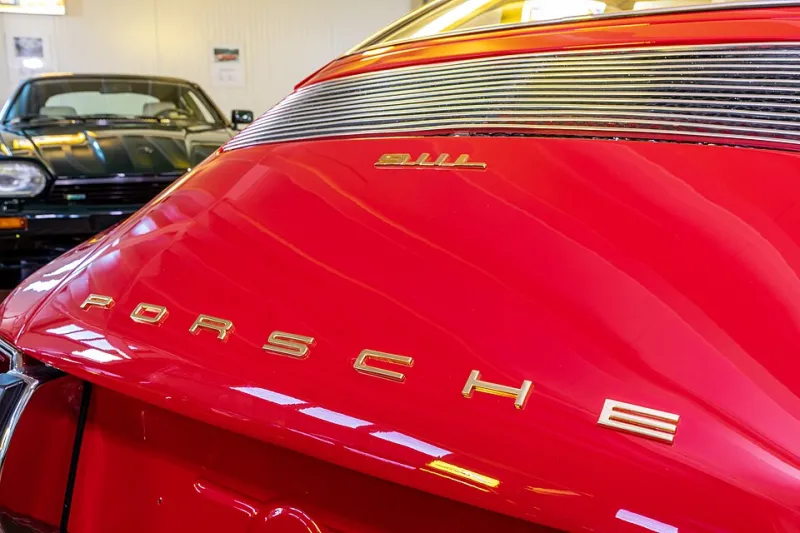
Photo: Dietmar Rabich, CC BY-SA 4.0, via Wikimedia Commons
Walk down any main street in an American small town and count the storefronts. A hardware store with a painted saw. A bakery with a rolling pin. A law office with a set of scales. The impulse to add a symbol to a business name is nearly universal, and it is also the reason so many small-business identities blur together.
There is another path, and it is one I recommend more often than clients expect: building the entire identity around a single, well-chosen typeface, treated with enough care that the name itself becomes the mark. No icon. No mascot. No illustrated flourish. Just typography doing the heavy lifting.
Why the One-Font Approach Works
Consider the brands you already admire without thinking about it. The New York Times. FedEx is a hybrid, but think of Knopf in publishing, or the countless law firms and consultancies whose reputations rest on a confidently set name. In the fashion world, the wordmark is practically the default — Calvin Klein, Ralph Lauren, DKNY — because a name set with authority signals maturity rather than effort.
For a small business, the advantages compound quickly:
- Reproduction is trivial. A typographic identity survives a photocopied invoice, a vinyl decal, an embroidered work shirt, and a two-color newspaper ad without degradation.
- Legal and licensing is simpler. You are not managing a secondary symbol across every application, and trademark searches are often more straightforward.
- It ages slowly. Icons date. Illustration styles cycle through trends. A distinctive typeface treatment, chosen well, can carry a business for twenty years with only minor refinements.
- The budget lands where it matters. Instead of paying for a symbol and a system, the investment concentrates on type selection, spacing, and supporting elements — the details most small brands get wrong.
Who Is a Good Candidate
Not everyone. I turn down the typographic route when the business model depends on a symbol: a children's brand that needs an illustrated character, a restaurant with a signature visual motif, a company whose name is so generic that a mark does the differentiating work.
The strongest candidates share a few traits. Their name is short — one to three words — and pronounceable. They operate in a category where credibility matters more than charm: professional services, boutique retail, trades, craft manufacturing. And their growth plan centers on reputation and word of mouth rather than shelf competition, where a symbol might need to work at a glance from across an aisle.
A custom cabinetmaker in North Carolina, a family optometry practice in Ohio, a boutique CPA firm outside Chicago — these are the businesses where a typographic identity consistently outperforms a drawn mark, because their customers are choosing based on trust, not shelf appeal.
The Risk: Looking Generic
The honest objection is this: a wordmark done carelessly looks like nothing at all. Set your name in a default font and you have not built an identity; you have built a placeholder. The gap between a generic wordmark and a typographic brand is enormous, and it is filled with decisions the untrained eye never notices.
Letter spacing that gives the name room to breathe. A custom ligature or a modified character that becomes the signature. A weight and width combination that no template offers. Color, scale, and arrangement rules that make the name behave consistently across a business card and a billboard. This is where the money goes, and it is precisely the work a rushed, budget-tier logo skips.
How the Decision Gets Made
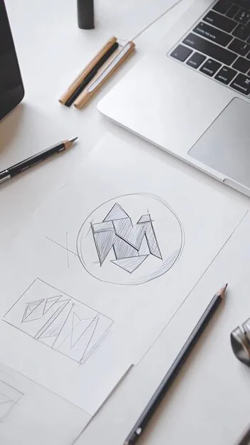
When a client comes to me, the typography question gets settled early, usually during discovery. I ask what the name needs to do on its own — will it appear on vehicles, signage, apparel, packaging? Is there a symbol the business genuinely needs, or is that an assumption carried over from a competitor? What does the competitive landscape look like, and would a distinctive wordmark actually stand out more than another icon in a circle?
If the answers point typographic, the engagement shifts. Instead of sketching symbols, I spend the time on type. Dozens of candidates get narrowed to a shortlist. Custom modifications are explored. The mark gets tested at small sizes, in single color, reversed out of dark backgrounds, and in the hands of a vendor who has never seen it before. If the name holds up under all of it, we have a brand.
A Smarter Place to Spend
For a small business with a real budget, the choice is rarely between a typographic identity and a good one. It is between a typographic identity done thoroughly and a symbol done thinly. The former usually wins — not because type is trendy, but because a name set with precision and used with discipline builds recognition faster than a mediocre icon ever will.
If you are commissioning a brand this year and your instinct says you need a symbol, it is worth pausing to ask why. Sometimes the answer is genuine. Often, it is just habit. And occasionally, the smartest mark on the street is the one made entirely of letters.